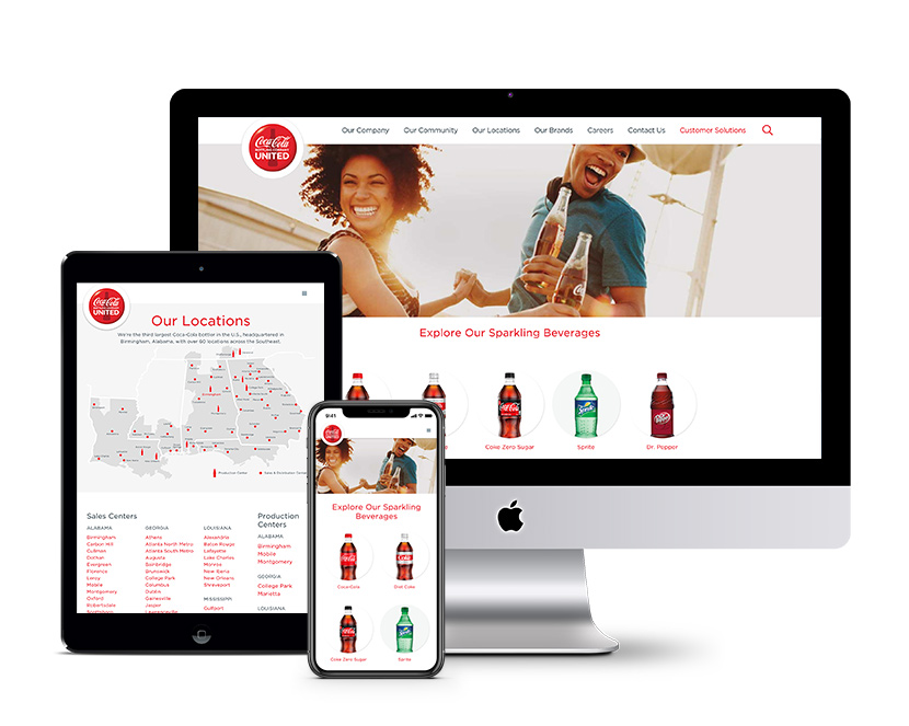
If you do only one thing in 2019 for your website, do this.

You might’ve already heard how important “mobile-friendly” or “responsive” sites are, but this year, responsive design can really be a game-changer for your business. Ever since smartphones hit the market in 2009, mobile usage has quickly become the preferred mode for users, and “responsifying” your site will make it viewable on a phone, tablet or desktop. Here at Infomedia, we counsel clients on the importance of having a responsive site. Still not convinced it’s worth it? Let’s break down the reasons why:
First impressions matter
Just like people, websites can get unfairly judged upon first glance. Having a responsive site is quickly becoming industry standard, and having an unresponsive site can be viewed as being behind the times. Why place obstacles in the way for potential customers to do business with you?
Repeat after me: Mobile is king
You can have a beautiful site that displays perfectly on a laptop, but what happens when a customer ventures to your site while on his lunch break? You work hard to ensure each customer has a great experience, so don’t overlook a vital part of your virtual “storefront.” There are many variables in maintaining an online presence, but one aspect you should control is how your site renders across all devices.
Google is watching
Last year, more people used their phones on Google’s search engine than ever. In fact, mobile phone usage has surpassed desktop according to various polls. Due to the increased mobile use, Google began their “Mobile First” indexing initiative in 2018. Google had been sorting sites based on the desktop version first. Not so anymore. If your site isn’t responsive this year, your website traffic will most likely suffer due to Google’s new algorithms. To check your site’s current responsiveness right now, use Google’s Mobile Friendly test link.

Does this all sound doom and gloom? We hope not. Having a responsive site ensures that your users experience your business online the way you intend it. It’s a wonderful way to take care of your customers’ needs as well as demonstrate online business savvy.
Not sure where to start? Infomedia is here to help! We’ll walk you through the steps to ensure Big Google doesn’t bury your site in its search results. Get in touch with us today on desktop, tablet, smartphone, or through our homing pigeon Steven. Just type “responsive design” into the Comment Form. Let’s get started!
