There's a lot of work that goes into designing a website and it's what you don't see that is probably the most important.

As a designer, it is my job to create a vision for your website. Part of that job includes making a website look good, but more importantly, it’s to create a website that accomplishes business objectives. To do that, it takes more than just a few hours in photoshop.
In the first design presentation, you get to see an initial look at your site. It’s called the HD wireframe. This is usually a black and white comp that gives you an idea of what the structure of the site will be, but what I should show you is all of the work I did to get to that point. There’s a process that goes relatively unseen, but it’s the most important work that goes into your site. It forms the foundation for me to build everything else. It’s the planning phase of your project.
Getting ready for the big reveal
I view myself as a problem solver, and the first step to solving any problem is to listen. The first meeting is not only an introduction to your entire production team but it’s when I get to listen to you. I want to hear…
- how your business works
- the way you currently use your website
- the people that use your website
- what they’re looking for
- the reason you want to redesign/start a new website
After that meeting, I have a pretty good idea of what the problems are and I spend the next part of the project determining how we can fix them, starting with the goals of the project.
Business Objectives
Business Objectives are quantifiable goals that I can later look back on to make sure the website is performing well. I write these down and use them to influence every decision I make while designing the site up until launch. Months, or even years later I can look back to see if the site is meeting those goals.
The Audience
The people visiting your site make up your audience. These people have very specific reasons for coming. To be able to make a website that is intuitive, I identify all of the different reasons people come to your site. It’s most important to satisfy the customer/client and the audience that makes up the majority; they aren’t always the same. The trick here is to group them according to similar needs. This helps me simplify decisions that I make later.
Calls to Action
To get a return on investment, your website must engage your audience. So, before setting the layout for the site, I outline the calls to action. These are the actions I want viewers to take when they come to the site. These actions are generally linked to the business objectives I’ve set for the site.
How many calls to action do I try to have? A quick answer is at least one, but there could be many more. I try to simplify them down to the most essential actions, but each audience and each goal might have a different call to action. Ideally, the actions we want people to take and the reasons people came to our site lineup. For example, a noticeable checkout button is beneficial to both the seller and the buyer. The seller representing the business objective and the buyer being the audience. After figuring out all these necessary actions, I can then start to map out how all of the pages are linked together.
Site Map
The site map shows the structure of the website. It’s usually the list of pages that are in the navigation menu. A website always has a navigation menu. Without one it would not be a website, it would just be a webpage. Here are some other basics to remember about the nav menu.
- It always goes at the top
- It is always the same on every page
- It should never move
- It should link to all major pages
When I start to work on the site map, I usually write down every page on the menu and check it against the goals, the audience, and the calls to action of the project. Putting a page that has nothing to do with any of these on the navigation is a waste of valuable space. If there are some pages that don’t fit as primary objectives but are still necessary for users to be able to get to I usually put them in a secondary menu off to the side. I’m not a huge fan of doing this but there are some websites where it’s needed. It’s one way to help keep the main navigation simple.
The Stuff in the Header and on the Home Page
Then, I write down every element I need to put in the header and on the home page. That list usually consists of some things that are guaranteed to be there every time like a logo, the navigation menus, the most important of the calls to action, featured images, etc. But in general I try not to make any generalities because the tendency is to overlook the work I’ve just done in favor of cookie cutter solutions. This is the stage where creativity can either flourish or be stifled.
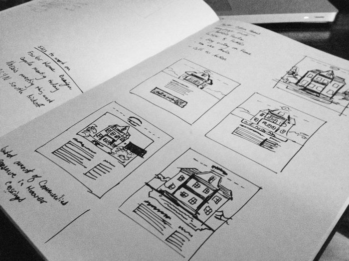
With the final list, I can quickly sketch out all the layout options in a bunch of little thumbnail sketches. This saves hours on the project because I can quickly identify and reject a layout that doesn’t work. Only after I feel good about a few sketches do I move onto the computer.
The Part You Get to See
After I finish all of that, I create an HD wireframe to show you. As you can see, a lot of thinking has gone into this one home page comp. In fact, it’s what you don’t see that is probably the most important. This black and white comp takes into account the goals, audiences, return on investment, and structure for your entire website. This is what I mean when I say it’s my job to create the vision for your website. When you look at the comp, don’t just look at how pretty it is. Make sure that it fits the vision for what you want your site to be.