Make sure there will be enough benefit from adding them to your website to risk wading through the minefield.

There are so many things that can go wrong with drop-downs and mega-menus that it can metaphorically be like wading through a minefield to get to your desired end result. Is it really worth the risk and could there be a better way?
Unexpected and Inconsistent Design Behavior
A lot of times, main menus will be designed so that there is no clear indication that it will open another drop-down or mega-menu, so when a new menu suddenly opens, it can be jarring to the user. There are also times when only certain main menu items open other drop-down menus while the other main items behave normally with no indication at all that they behave differently. This is even more problematic, because it will take longer for the user to understand how to navigate the website. Take a look at this image of a website’s main navigation for an example.

Information Overload
Sometimes you can show a user too much information. It can be like trying to find Waldo in all that chaos. One example that comes to mind is the Staples website. Do people really look through all these links trying to find the one link they need?

Mobile and Accessibility Problems
Most drop-downs and mega-menus are triggered with a hover event which basically means that as your mouse pointer goes across that part of the screen, the menu will open. As you move your mouse pointer off of the menu, the menu will close. That’s all well and good if you have a mouse.
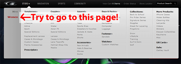
There is a subset of the population that is mobility impaired and can’t use a mouse at all and have to navigate websites using the keyboard. A common way to do that is to tab through the links on the page. Go to some of your favorite websites with mega-menus and try tabbing through the navigation. It can be incredibly frustrating if not impossible to get where you’re trying to go. On some websites, you just keep tabbing through hidden links that haven’t been revealed through a hover and have absolutely no idea where you are on the page. Even if you can see where you’re clicking on the page, some of these menus have so many links, that you can get carpel tunnel just tabbing through them all! At the time of this writing, for a perfect example of how awful this can be, go to Oakley.com and try to get to the women’s store by just tabbing through the links using only your keyboard. I dare say it’s impossible.
The other, much larger set of users is the growing population of people surfing the web on their phones and tablets. If your site is responsive, you can plan on changing the complex drop-down navigation to something that is simpler to use on a mobile device. Although, that usually means that you’ll need to think of clear main menu items for your mobile users anyway. If your site isn’t a responsive design or you don’t have a separate mobile site, you can even see different behaviors on different operating systems (iPhone vs. Android for instance).
On iPhones and iPads, drop-downs are typically triggered by pressing on the main menu item. To get to the page that the main menu item actually links to, you have to press the menu item twice. I only found that out through experimentation. I’m sure many users are not aware of that behavior.

On Android phone and devices, it’s even worse. When you press the main menu item, the drop-down flashes for a second and then it takes you to the page the menu item linked to. These users know that there is a drop-down menu, but they can never get to the pages from that menu. Therefore, if you don’t have links to those pages in the body of the website, they’ll never be able to get there.
I’m Not the Only One
In an article written by web usability expert, Jared Spool, he stated this after observing problems with mega-menus with their clients:
“As each implementation launched, we saw problems. It was not unusual for our e-commerce clients to experience a 15%-20% drop in revenues immediately upon deploying their new mega-menu-based navigation – revenue that didn’t seem to come back, even once users “got used to” the change. Non-e-commerce clients also saw dramatic changes in their key performance metrics, mostly declines, as they rolled out their own mega menu implementations.”
A Possible Better Solution
Instead of using these areas as a dumping ground to try to link to every single page of your website from one location, a better solution could possibly be to make the main menu items very clear to your users. I would be willing to bet that most of the time a user will know what to expect to be in a main section of a website without having to see a list of every single page in that section if it is labeled correctly. For example, if you have a heading named “Products”, I’m guessing the user gets it that all of your products are listed in that section. The same could be said for “Services”. It’s probably not necessary to list your services in a drop-down.
Once the user knows feels confident they’re going in the right direction and feels that every click they take gets them closer to their desired destination, they have no problem making a couple of extra clicks to get there. This concept is called the “Scent of Information”. It was originally coined by Xerox’s Palo Alto Research Center team and was made popular in a well-known paper and presentation by web usability expert, Jared Spool. For further reading on that subject, his paper is available for download.
Final Thoughts
Drop-downs and mega-menus aren’t inherently evil, but you need to make sure there will be enough benefit to adding them to your website to risk wading through the minefield.
Photo credit: Some rights reserved by BR0WSER.